Your color scheme for the wedding has the power to set the vibe – so
choose wisely. Focusing on the color theme early on is important to ensure that
everything else obtained for the wedding is well coordinated and suited to the
wedding as a whole. The colors are completely up to you but you will need to
take into account where you're getting married, and the formality or
informality of your ceremony and reception.
With the
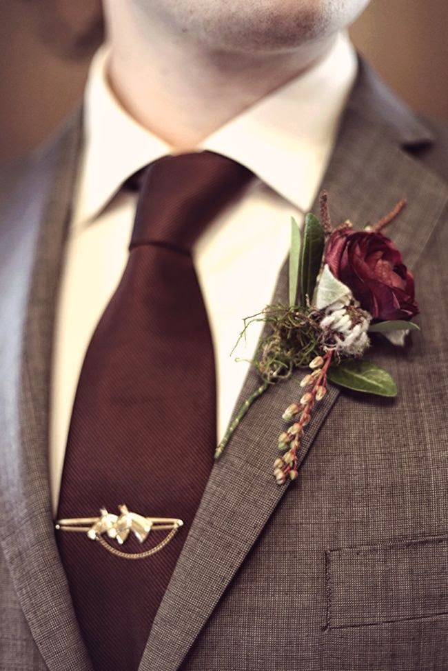
natural colours of Autumn all around us it is easy to see why the deep hues of
burgundy make for a perfect colour scheme.
It is common to have a color palette with up to five main colors for
many weddings now but you do need to be careful that the colors don't overwhelm
the wedding or
create a sense of disjointed themes. Also, exact color matches on everything is overwhelming; instead, go for shade
variations on the original colors. Rely on small touches here and there for
getting across the wedding color scheme rather than huge bold displays of it,
such as the font color on invitations, and little ribbon touches here and
there.
- · Use the color theme on
the invitations, the place cards, the ribbons around flower arrangements,
the flowers, in the flower girl's hair or waist sash, and on the wedding cake.
- · If the color of flowers you
really wanted are not in season, rely on white flowers and use
the ribbons and other decorative elements in the color of choice
instead. This will still indicate the color theme without losing the beauty of
the floral arrangements.
Here are some great tips when choosing your
colours;
Typically, you want a
maximum of three colors in your palette: one to dominate, a second to support,
and a third as the accent. There are three ways to choose coordinating colors:
· Complementary Colors (these
colors are opposite each other on the color wheel, such as blue and orange, or
red and green.)
· Analogous Colors (these
colors lie next to each other on the wheel, such as green, lime green,
blue-green.)
· Monochromatic Colors (these
colors have variations of the same tone, such as bright red, dark red, etc.)
POWERSCOURT HOUSE & GARDENS
Enniskerry | County Wicklow | Ireland
T: +353 1 204 6000
W: www.powerscourt.com/house/weddings
E: hospital@powerscourt.net